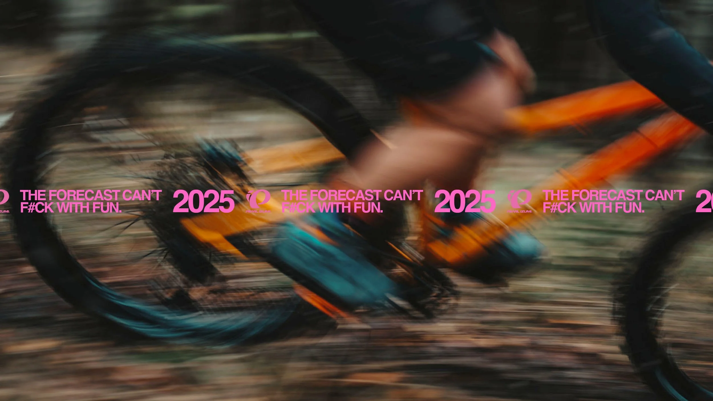

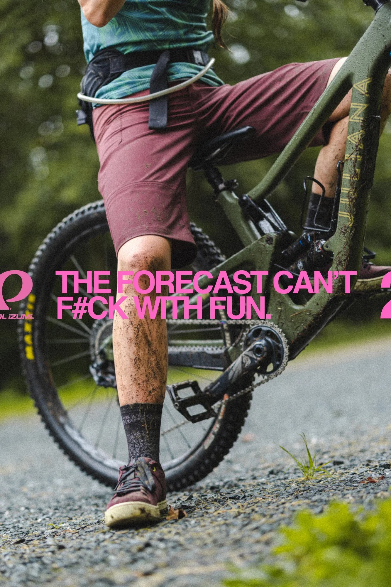
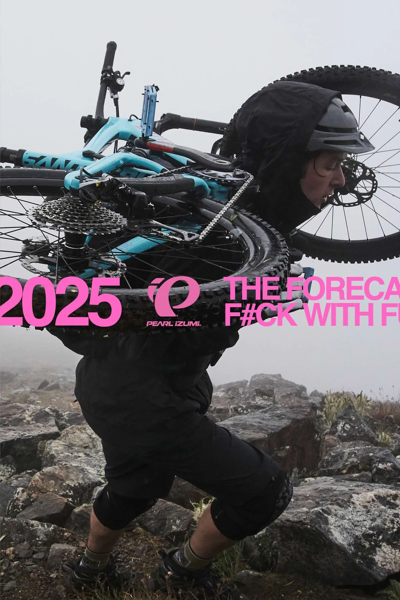
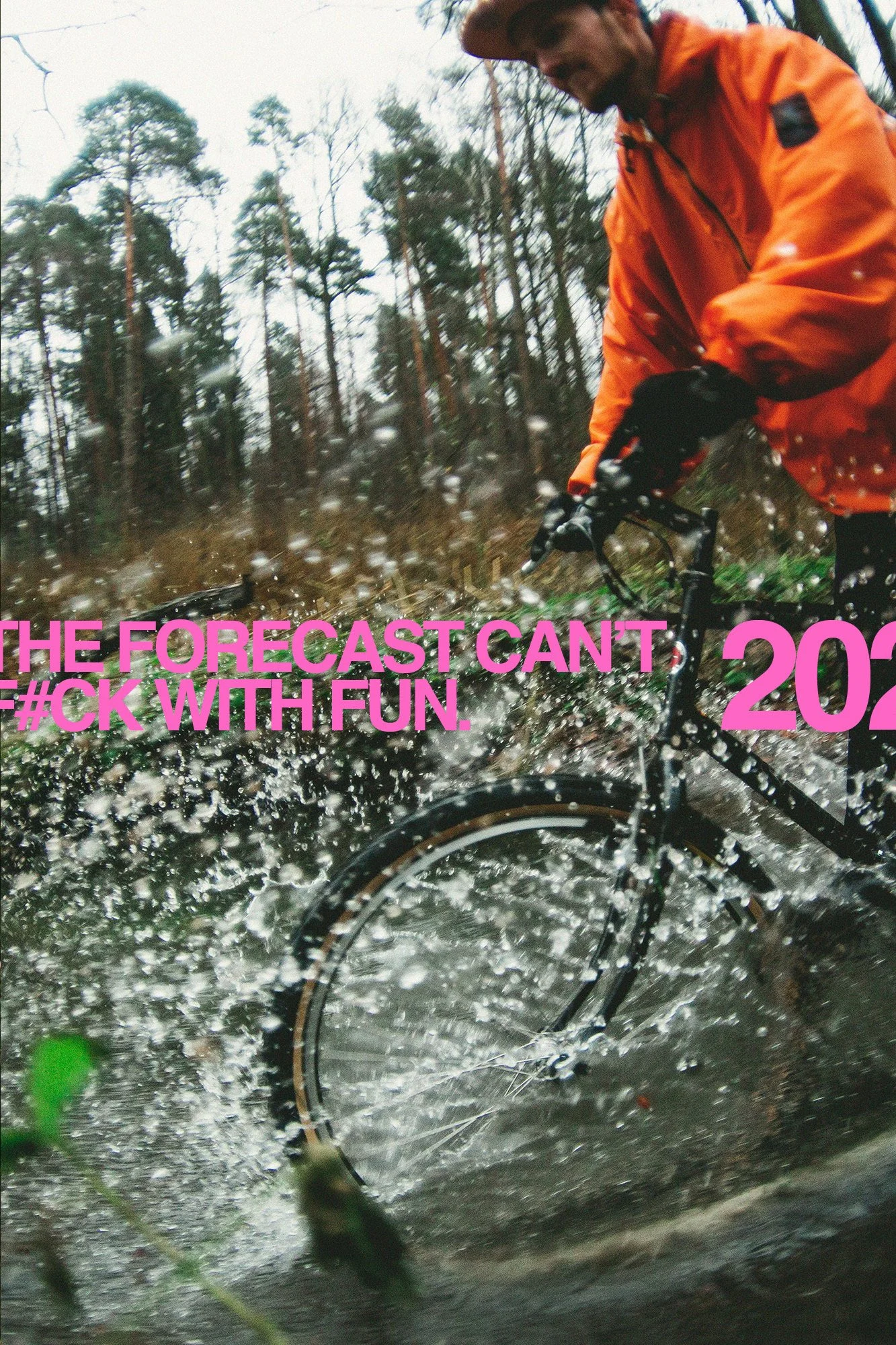
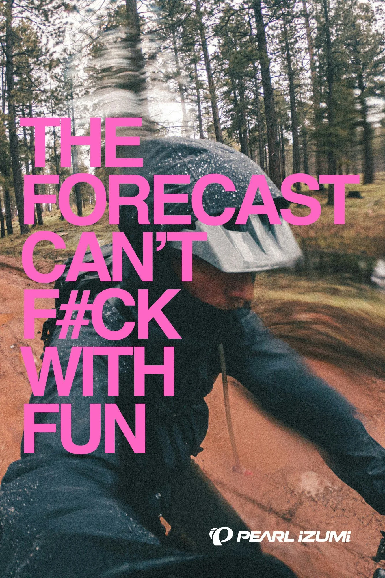
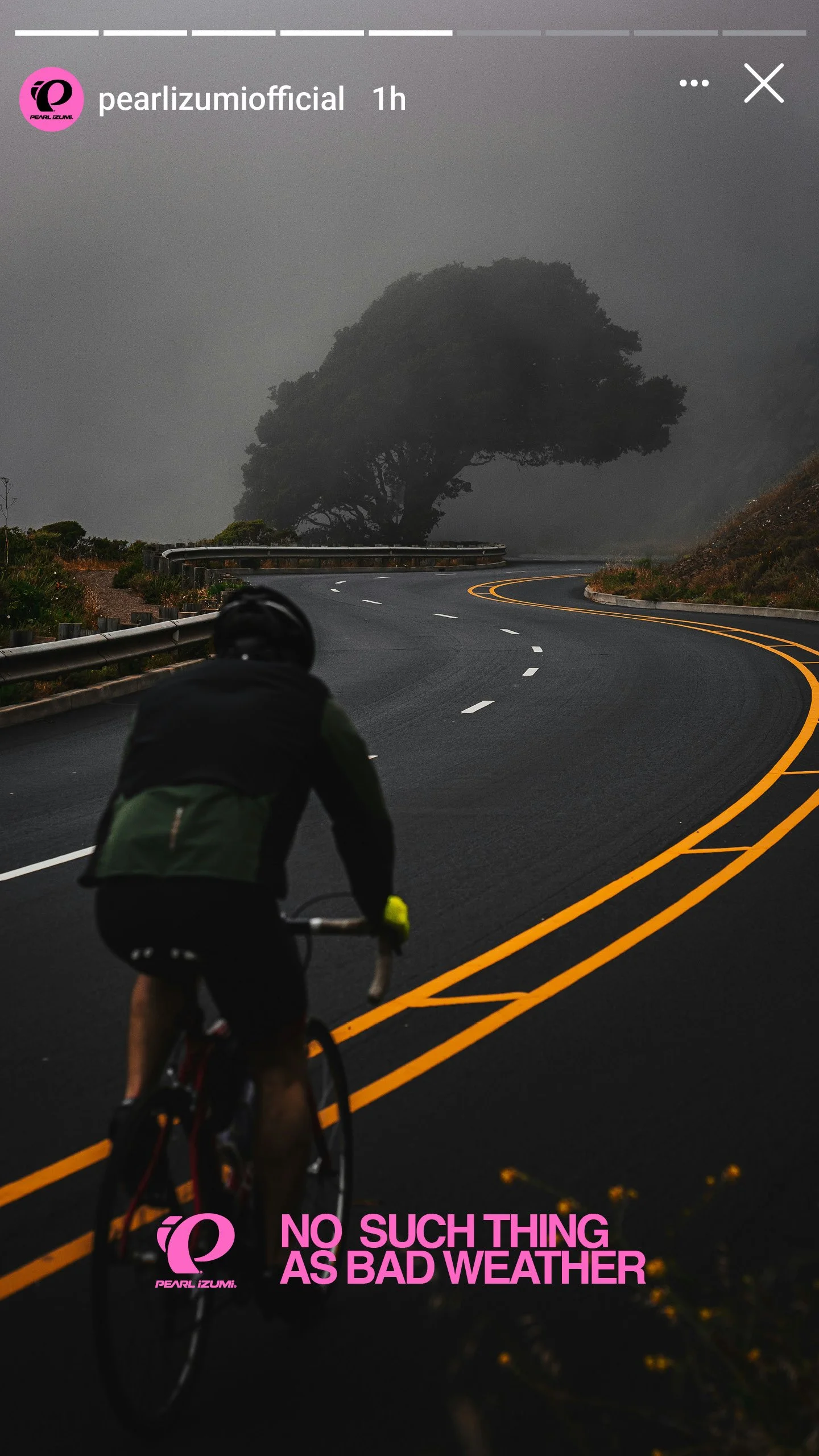
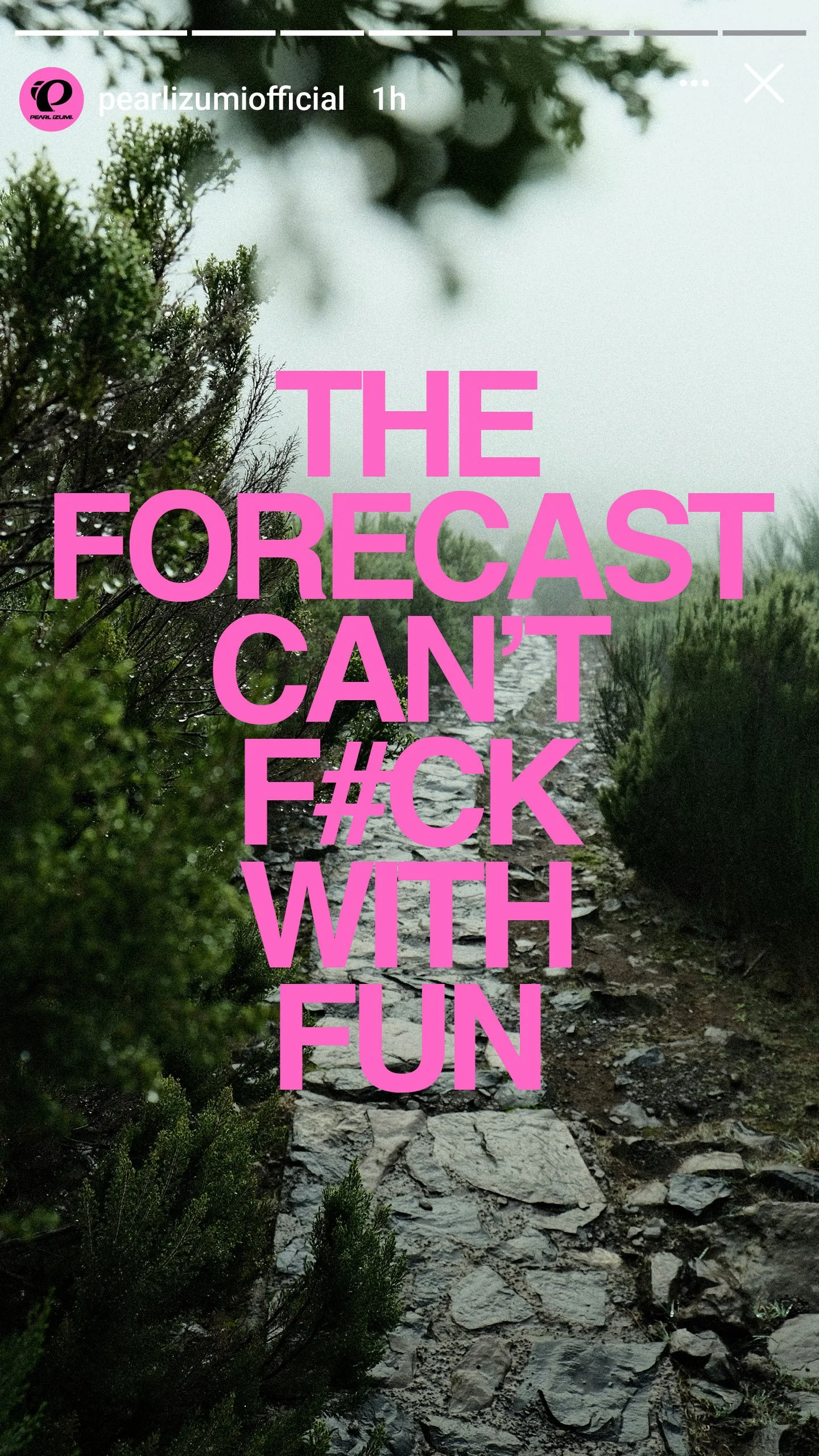
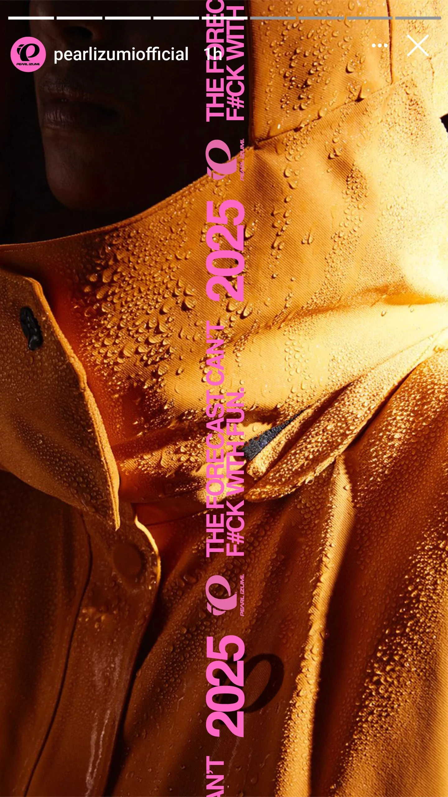
“The Forecast Can’t F#ck With Fun.”
for:
Pearl Izumi
SPECIALTY OUTDOOR APPAREL
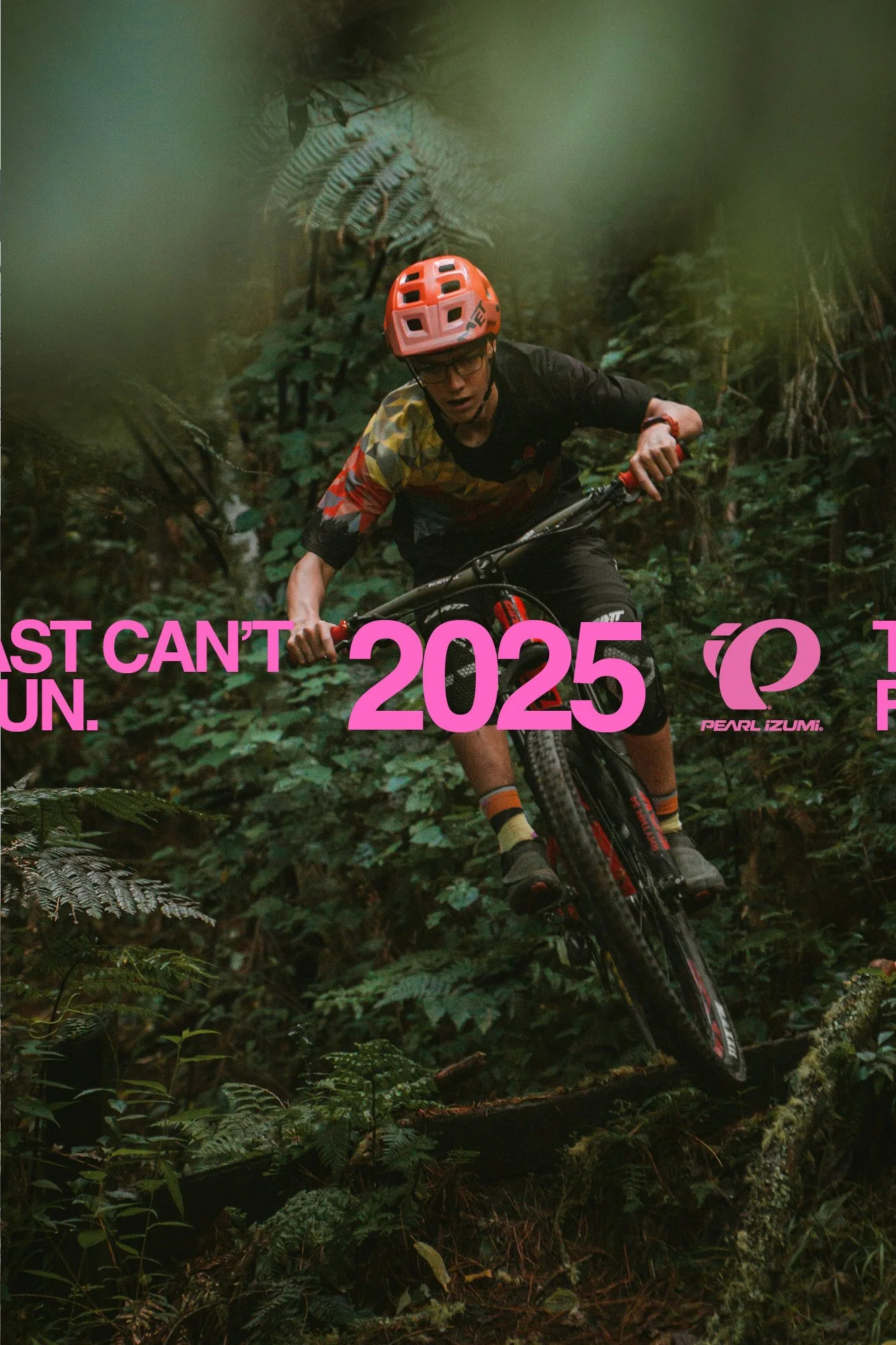
2025 | NORTH AMERICA & Europe

Value Summary:
A full funnel campaign system for Pearl iZUMi's FW25 weather protection line, built on one insight: the riders who buy cold weather gear aren't chasing suffering, they're protecting joy.
Project information
Pearl iZUMi has been making cycling apparel since 1950, when founder Kinji Shimizu crafted the brand's first jersey in Japan. 75 years of innovation later, the brand is one of the largest dedicated cycling apparel companies in the world, building gear across road, gravel, and mountain bike for riders who treat the bike as central to their identity.
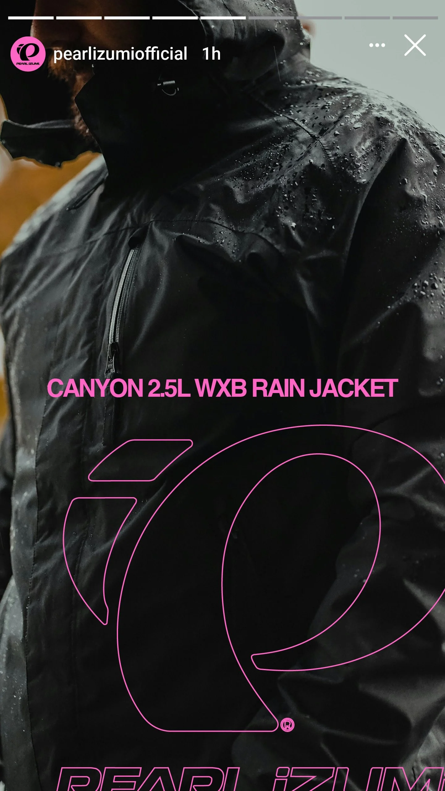
We were tasked with expanding the creative direction and developing the campaign architecture for the FW25 weather protection collection, anchored by Pearl iZUMi's AmFIB range and PI Dry fabric technology. The system would need to work across out of home, DTC, ecommerce, social, email, and paid media. More than a seasonal push, the campaign needed to give Pearl iZUMi a voice in the fall/winter conversation that no other cycling brand was using.
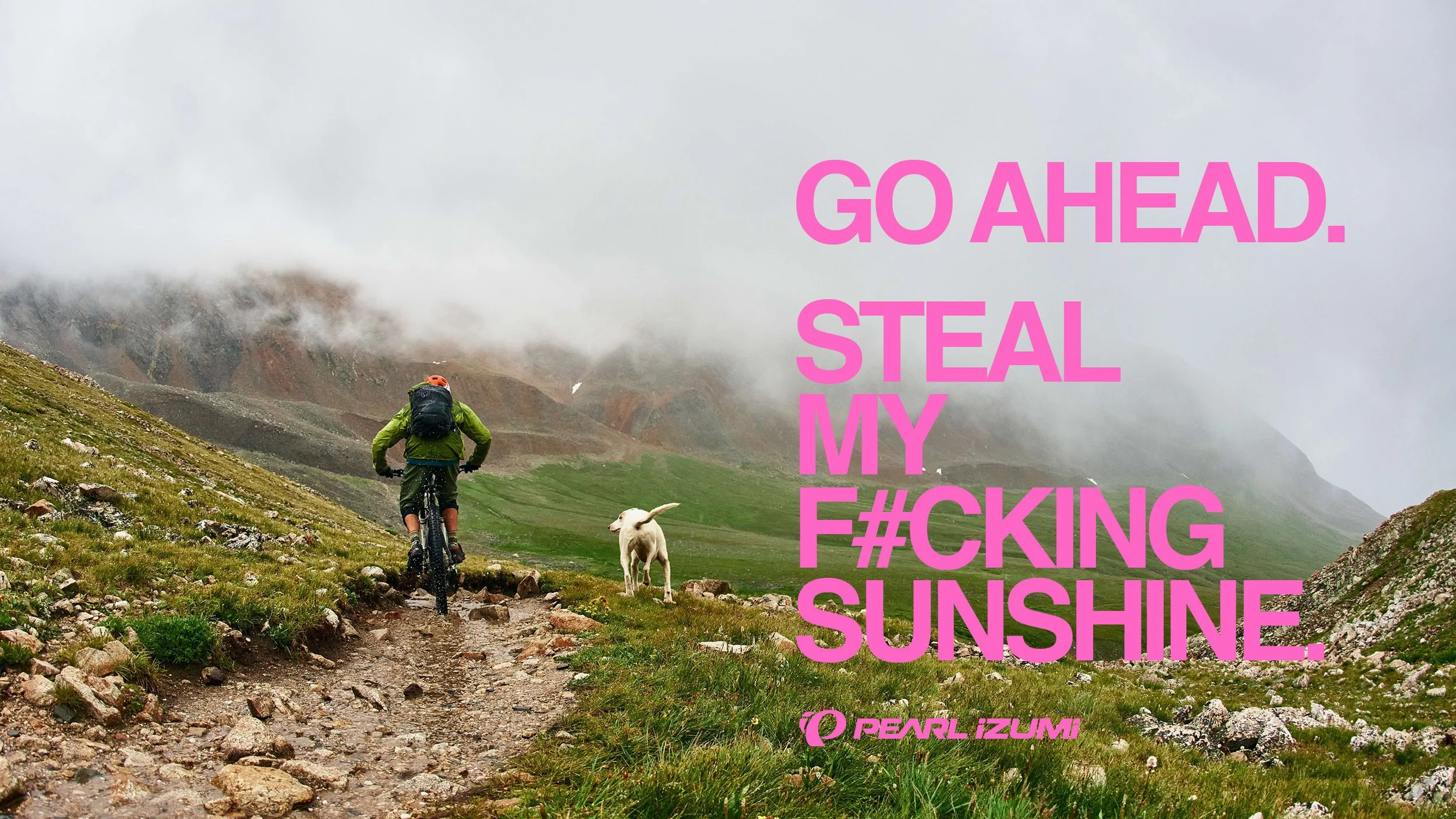
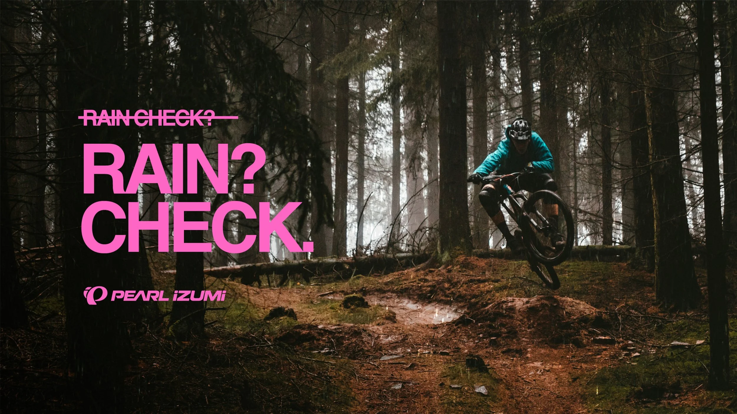
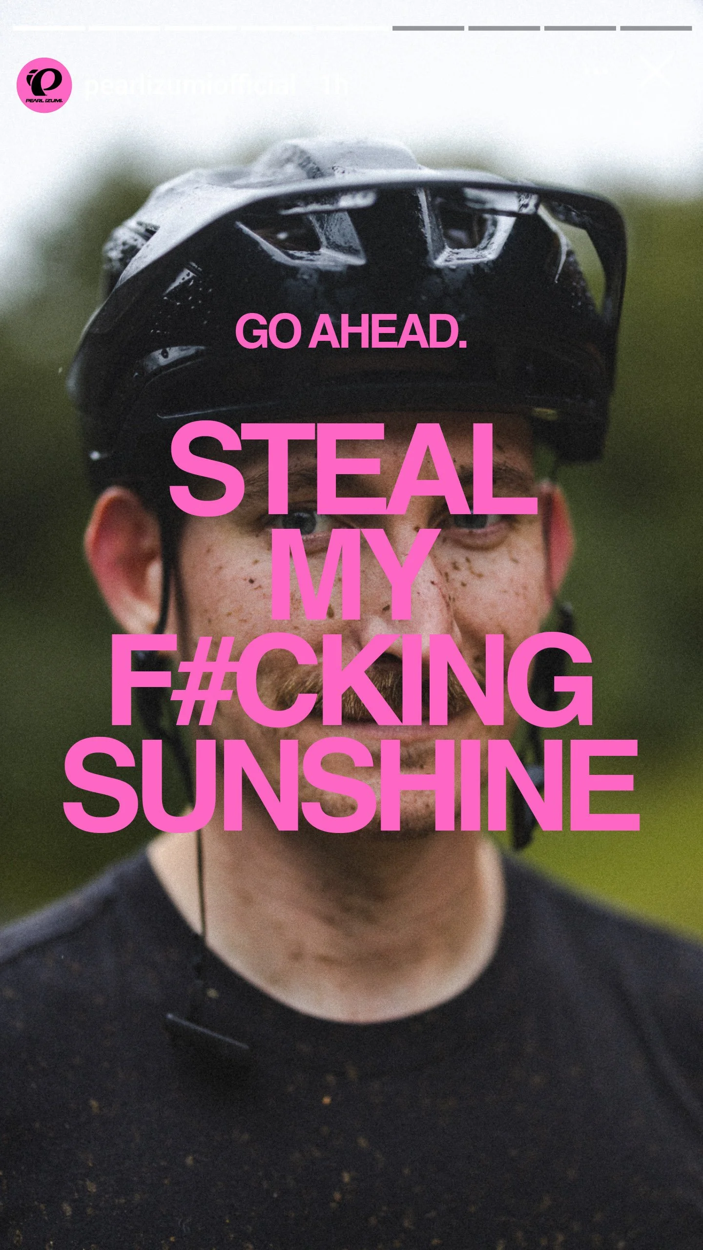
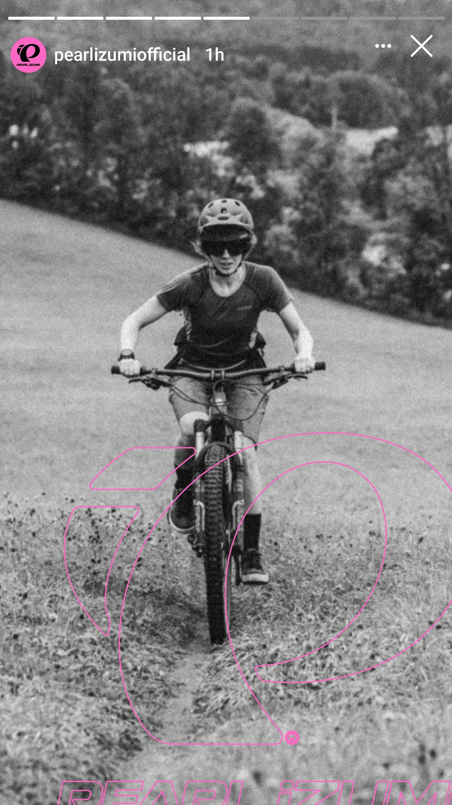
The problem was familiar. Every cycling apparel brand runs a cold weather campaign. Nearly all of them land in one of two places: the sufferfest narrative, where bad weather is a test of will and the rider earns respect through misery, or the technical product story, where seam tape ratings and waterproof membranes become the pitch. Both are rational, but neither reflects how Pearl iZUMi's rider actually thinks about weather. In a feed full of dark, moody, solitary riders with grim expressions, everything starts to look the same.
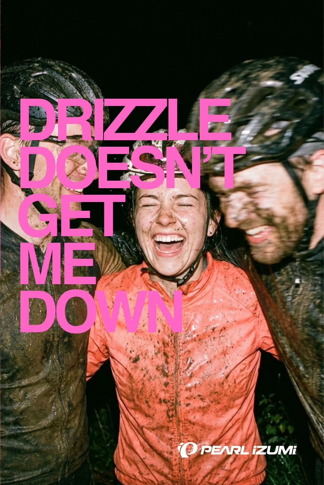
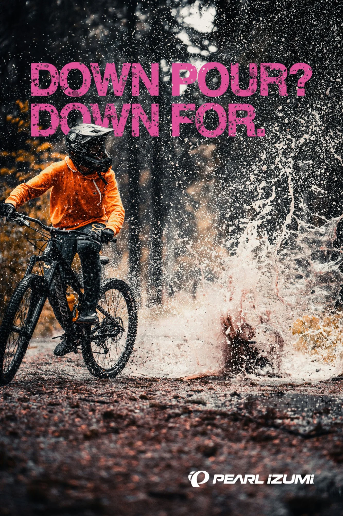
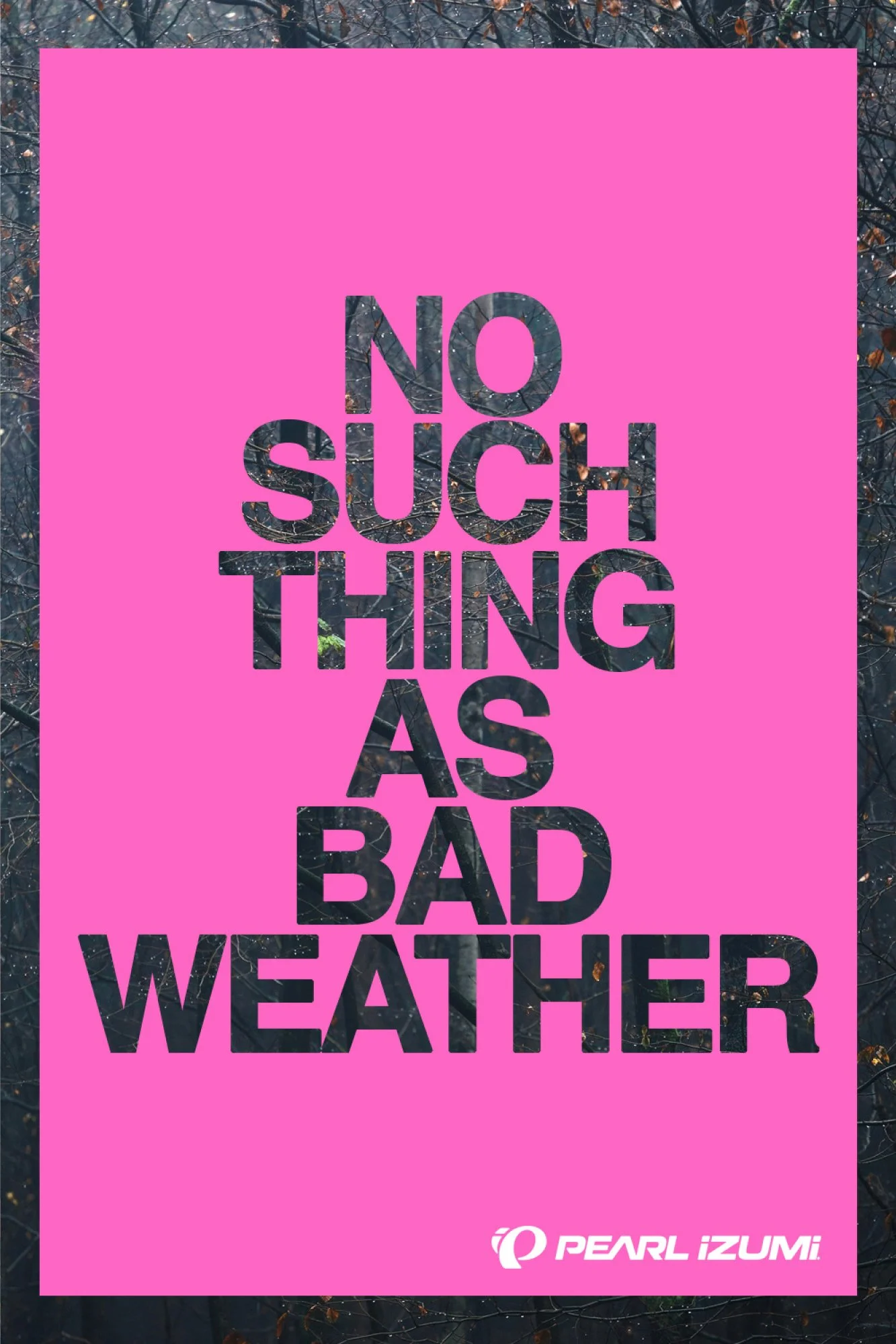
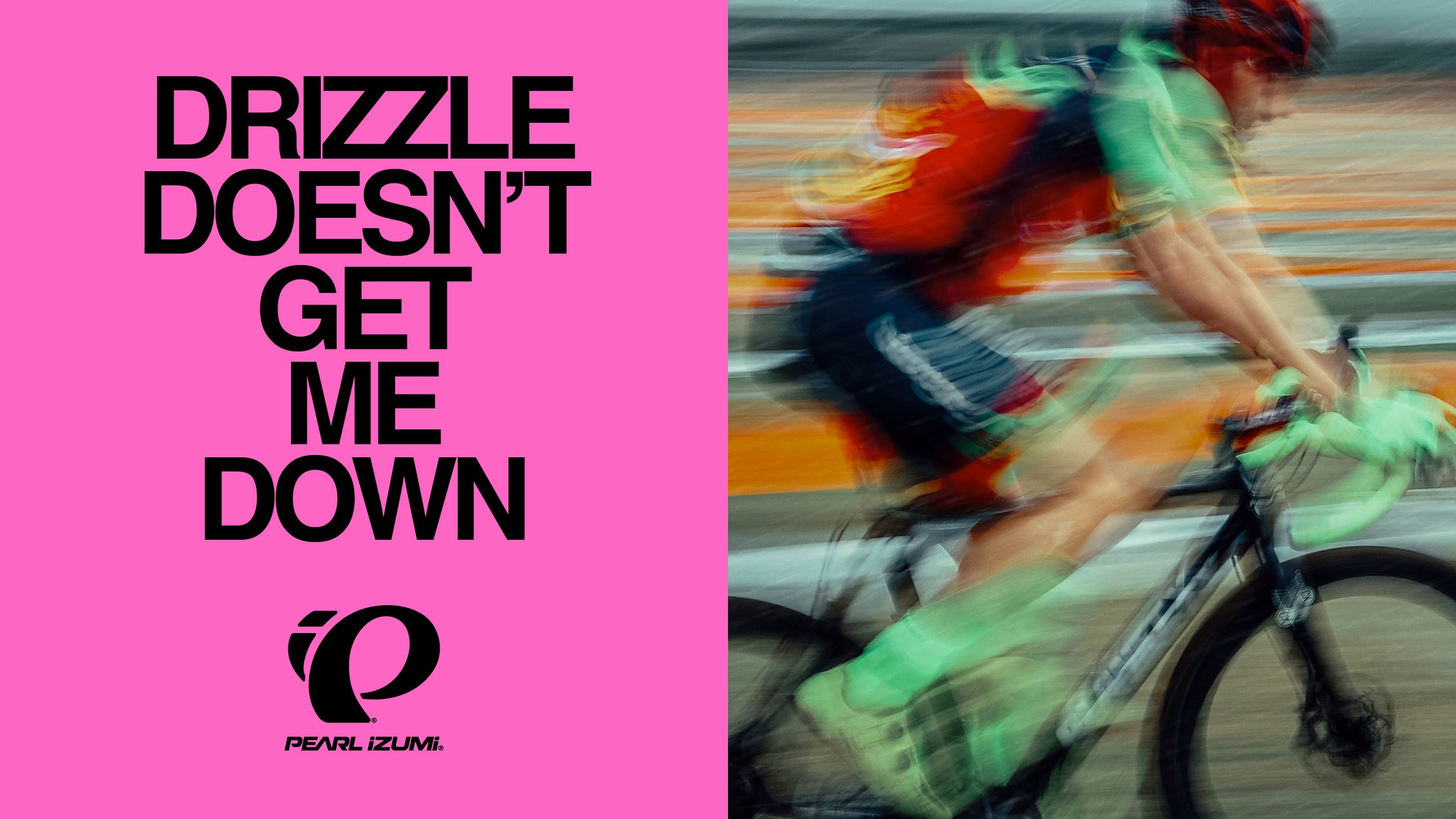
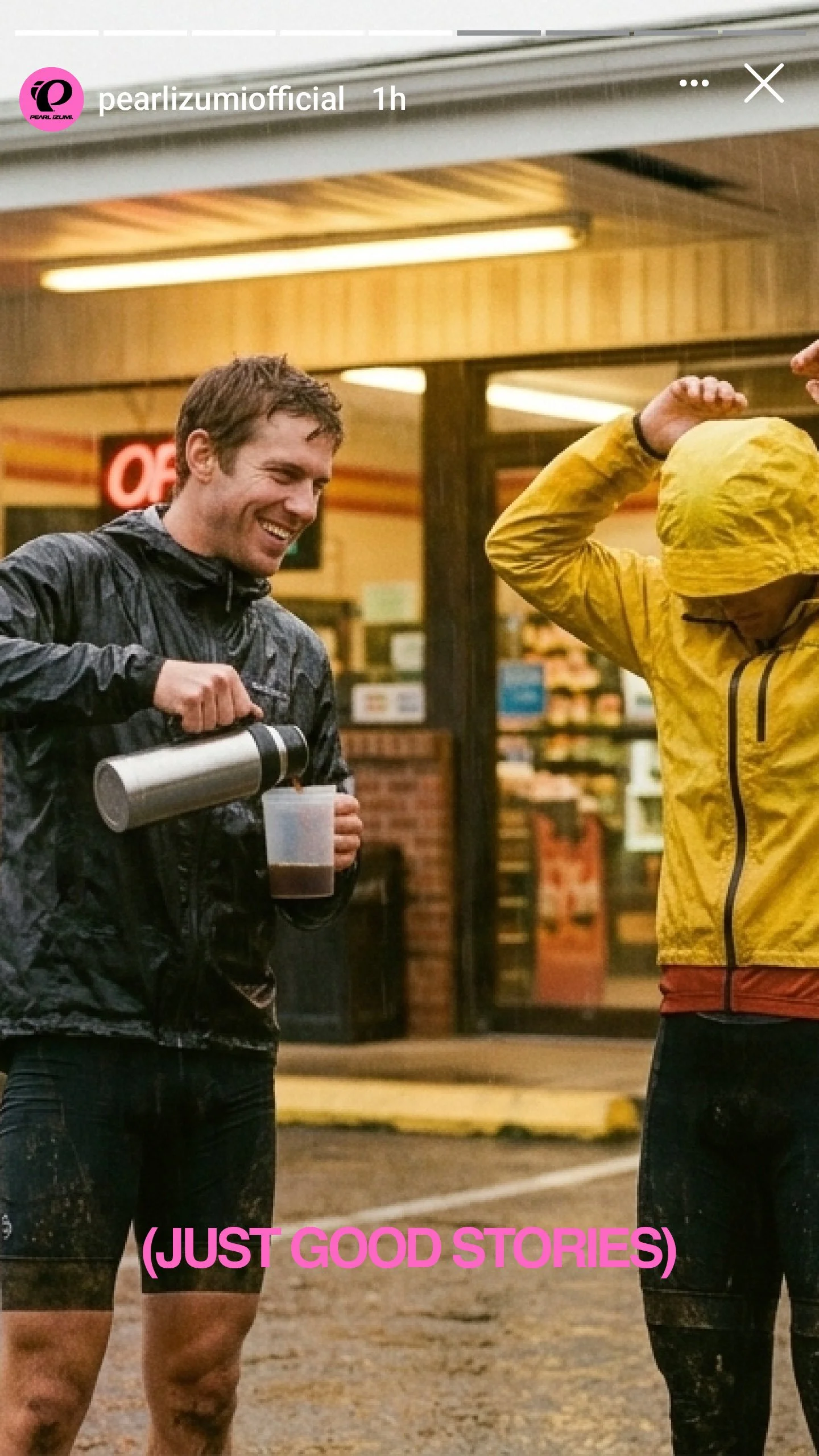
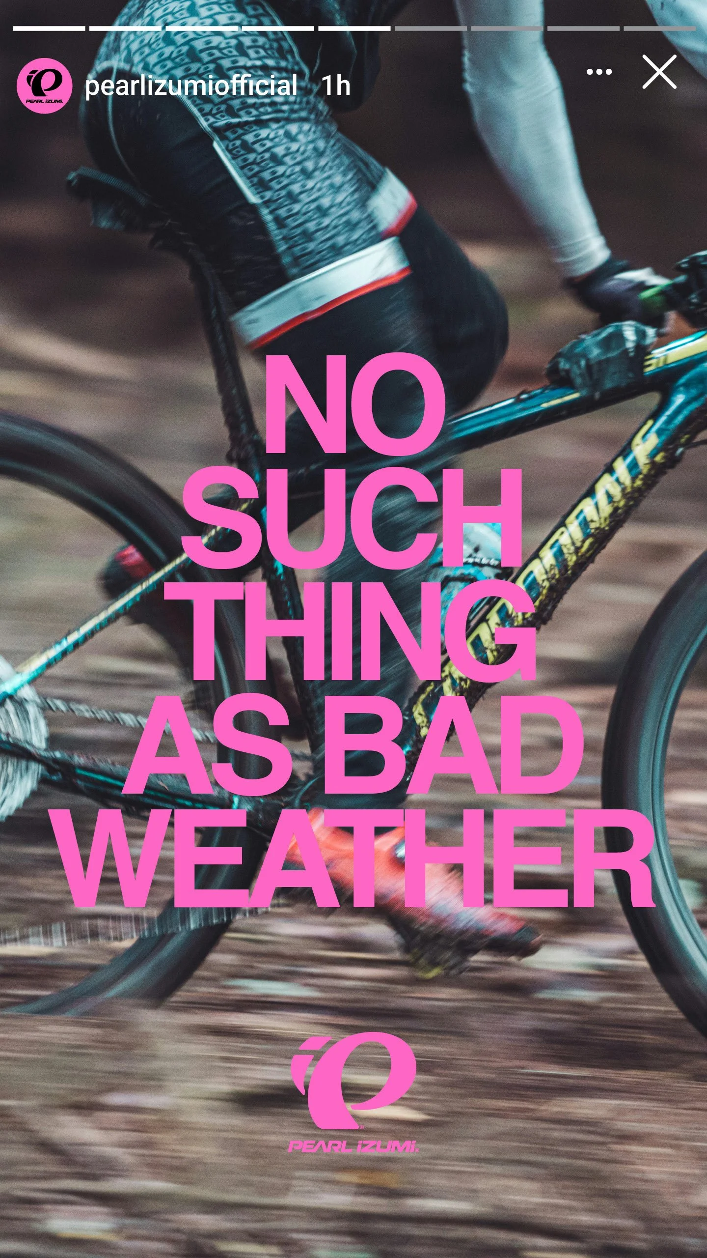
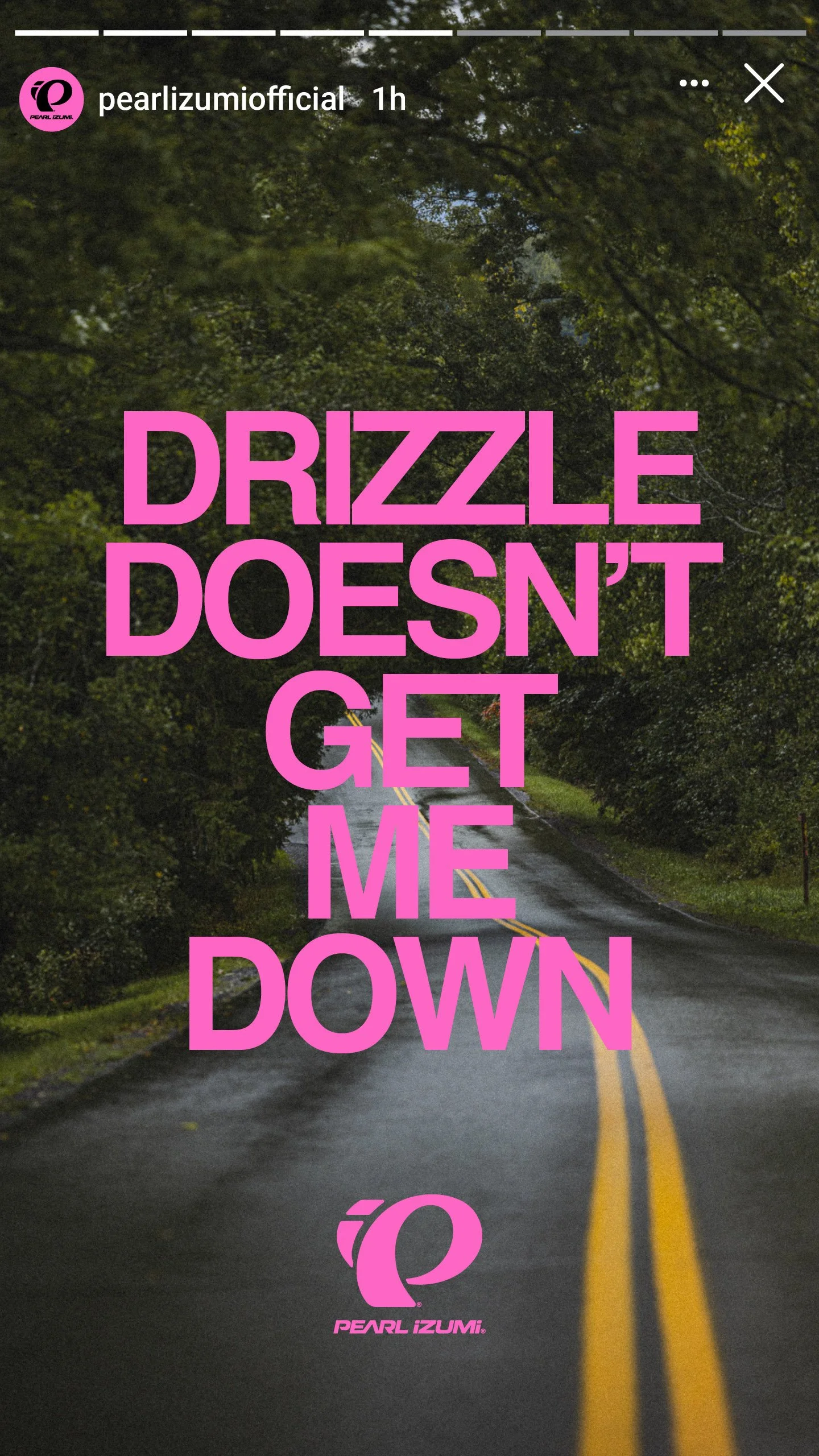
Our solution: lead with joyful defiance, not suffering. The insight was that riders who invest in cold weather gear aren't motivated by pain. They ride because the ride is the reward. Weather is context, not an obstacle. The best brand work starts with feeling, and this campaign was built from the feeling of choosing to ride on a day when the weather says you shouldn't. The voice that came out of that was loud, profane, joyful, and impossible to confuse with anyone else in the category.
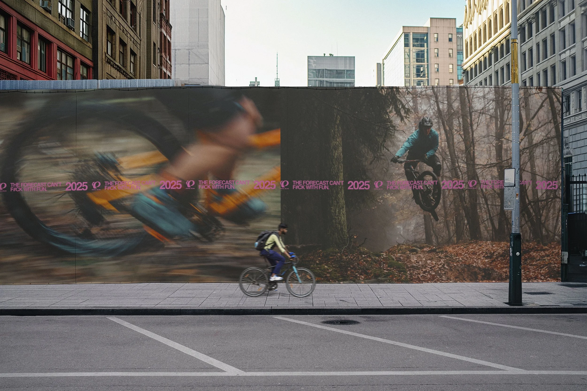
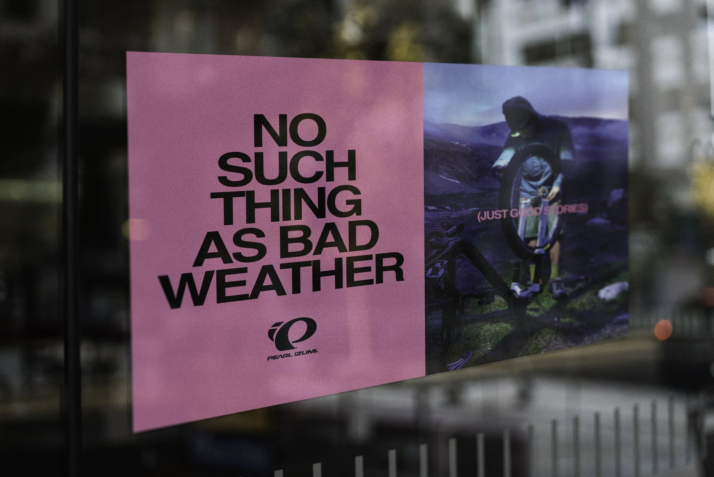
The campaign system was built to carry one emotional territory across every stage of the buyer's journey. At awareness, the brand voice arrives with a point of view: oversized pink typography, full bleed environmental photography, and headlines designed to interrupt a scroll or catch an eye from the road. At consideration, the attitude connects to the rider's specific world: discipline navigation across road, gravel, and MTB, ecommerce modules pairing secondary headlines with product, and editorial product cards that give the gear personality instead of a spec sheet. At conversion, the product delivers on the promise the campaign made: a dedicated collection landing experience, geo targeted email tied to real weather conditions, and retargeting creative that holds the system's character at every format size.
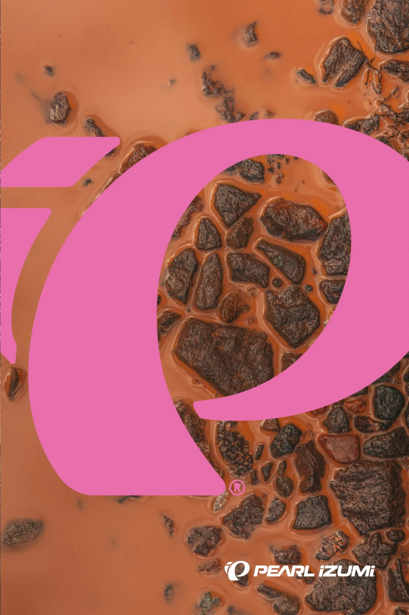
The color strategy used hot pink as the campaign's signature, a deliberate break from the muted earth tones and monochrome palettes that dominate fall/winter cycling marketing. Against dark, atmospheric photography, the pink type became an instant identifier: visible, unapologetic, and unmistakably Pearl iZUMi. Utilitarian micrographics, weather data callouts, and location stamps gave the system texture and depth across formats without competing with the headlines.
Built across three disciplines, designed for every wet climate market, and scaled from out of home to retargeting without losing its voice, the system gives Pearl iZUMi a fall/winter presence that sounds like nobody else in the category.
Credits
Agency: The Public Works
Director: Ian Fohrman